 The Design Observer Group chooses the top 50 book covers each year, and 2014 was no exception. However, I wanted to put the covers to a vote by NovelRank users: authors, publishers, and book lovers. Out of the 50 book covers, ~40 were available on Amazon and were used for this experiment. There were at least 75 votes cast for each cover to generate the results, but first some qualifiers.
Over the past two months I’ve watched the lead change dramatically and realized I needed to set some different ground rules. Since this voting contest was truly the best vs the best, it wasn’t fair to just see who was on top with the most votes (each cover was pitted randomly against another cover and users chose which they preferred between the two). So my criteria is any cover that won at least 50% of its votes was doing well. Across most of these covers a few things are clearly favored: Full color imagery, title/imagery match, and readability at a small scale.
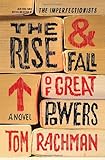
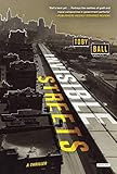
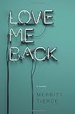
Here are a few examples: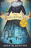

The Worst Covers
The really telling covers were the worst covers. The absolute worst cover by far was this one: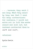
This wall of text is completely uninteresting in the world of small book cover images and online book shoppers. It actually received only 1 winning vote for every 10 head-to-head appearances. Here’s one more example: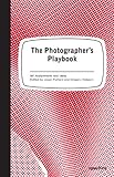
The win rate for this cover was only 30% (3/10 matchups were won) and I honestly don’t know how it made it onto the list of top 50 book covers since it lacks any of the key elements of the top books.
Conclusion
If you’re interested to see all the covers, check out this custom user page I put together.
I hope you enjoyed this little adventure; and for those of you who did the voting, thanks for the feedback and stay tuned for some new questions!

